


Weight Wager App
UI UX App Design

Overview:
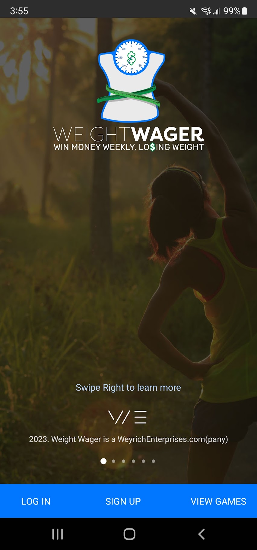
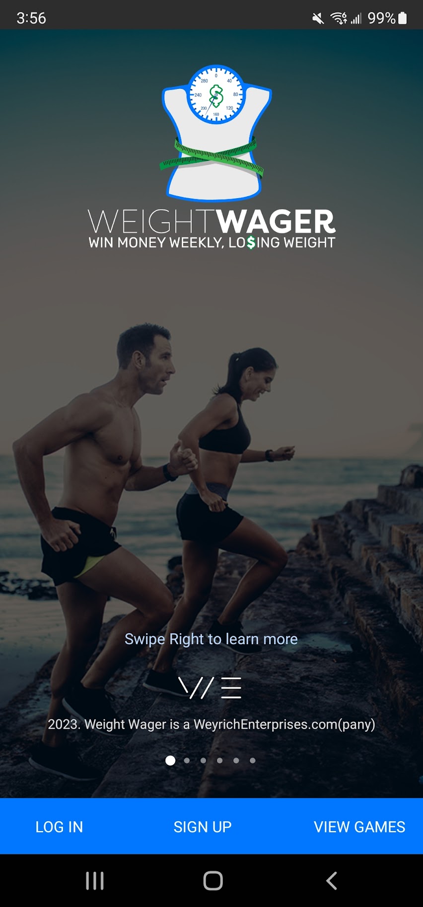
Weight Wager is the First Live, National, Weekly, Weight Loss Scale Competition. Imagine, each morning, thousands of American weight loss competitors stepping onto their wireless smart-scales as they sync their weight loss data into a national, real-time Weight Loss Leaderboard. Competitors make a weekly bet on themselves that they will lose -1lb. Competitors that gain weight or don't lose the full -1lb from Monday to Monday pay the bet. Competitors that lose at least 1lb weekly, win a share of that money.
Final Objective:
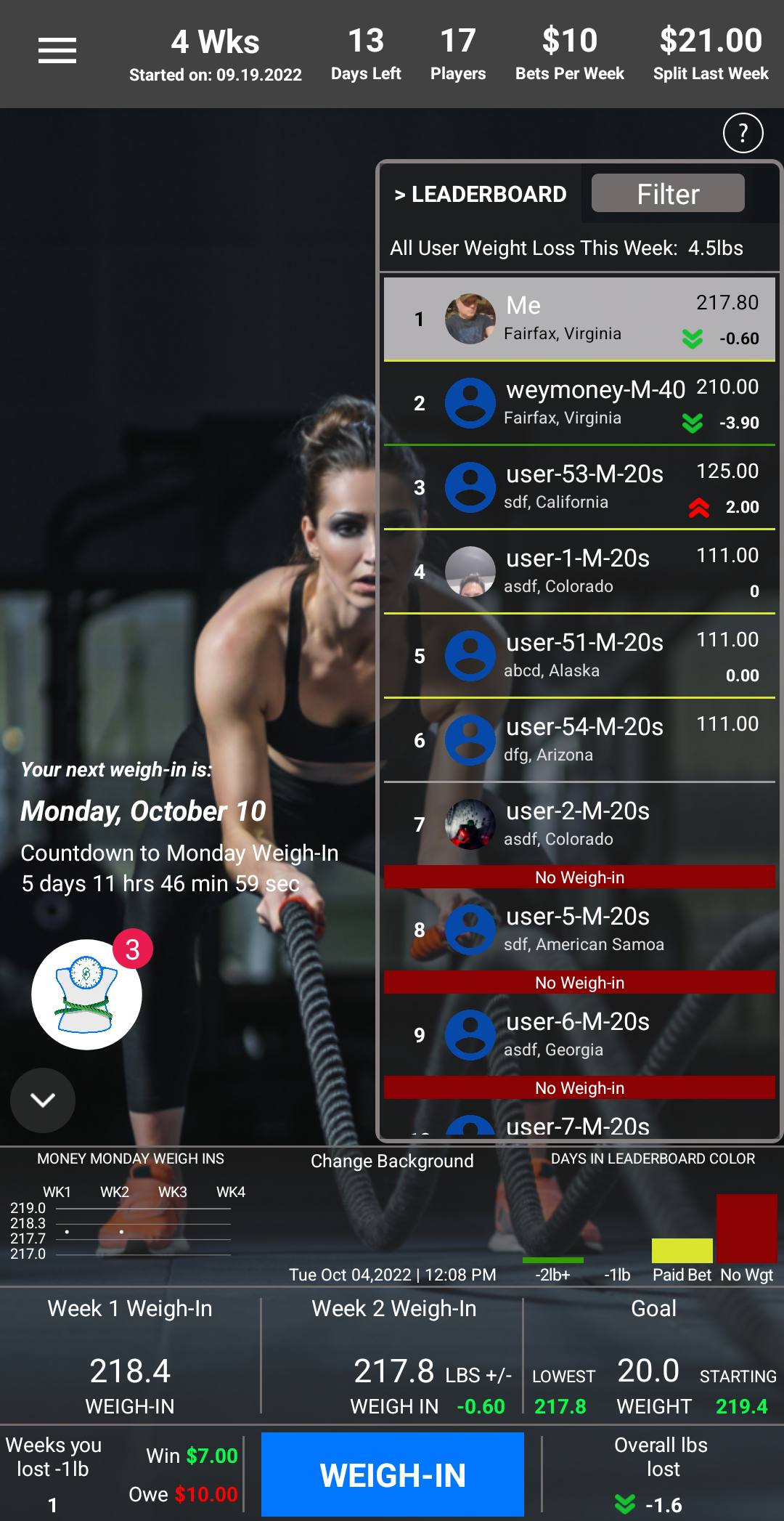
To provide plenty of features to keep the user engaged, such as weekly weigh-ins, a daily growing money pot (new users onboard into your game all the time so it's exciting to check on the money), on Monday's checking to see if you went down in weight and won money (or lost it). And to make it for Native Android and iOS.
Project Includes:
Personas
Information Architecture
Mid Fidelity
High Fidelity
Final Design
Prototype
Final App
Objective:
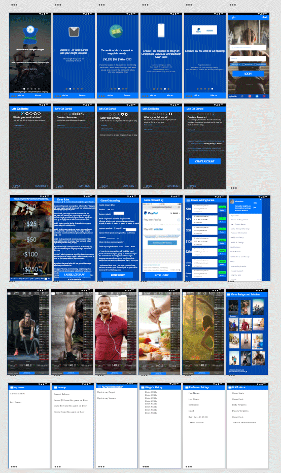
UI UX Mobile app designer leading the app and responsive website design from conception to delivery. I worked hard to decrease the number of signup and onboarding screens and made sure that the user only accomplishes one obvious feature/utility per screen, so that the initial user experience is more smooth. 1st Row Marketing Screens, 2nd Row Signup Screens, 3rd Row User onboarding screens, 4th Row User Game Screens, 5th Row Hamburger Menu.
Role and Responsibilities:
I designed high fidelity wireframes (pcitured left) for all of the 40 apps screens. Then I designed up all 40 screens based on weight loss user personas. Then later in final UIs I used weight loss and exercise imagery to target those personas with inspirational and aspirational imagery for where the user is at in their weight loss journey.
As well as, an overall dark theme to match current design trends. When the app was done, I designed a fully responsive, HTML 5 marketing webstie for the app itself.
Tools:
Figma
XD
Photoshop
How I got there: User Research
I initally asked 10 beta testers to answer pre-qualification questions to gather their personas, ranging from how much weight do they want to lose, to if they owned a smartphone and scale to what are their motivations for weight loss. The onboarding pre-qualification beta user form is here:
https://weightwagerform.carrd.co/
Then the app was tested with the remote testing tool Helio.app where I asked over 25 user research and post-usage app experience questions to determine pain points and UX Defects within the app.Here are some responses from that test:
https://my.helio.app/report/01EAAD0XDZ59F605TH78RDRB8V
These users had used the app for 3 weeks. Users ranged from men to women who were excited to lose anywhere from 5lb - 110lbs. All of them gained weight recently. All of them own scales or smart scales in their home. All of them own smartphones. All of them have enough disposable income where they could bet (and lose) anywhere from $10 - $100 per week on the weight loss competition. The interviews conducted helped look at the usability and intuitiveness of features and the content. I also got emails from users asking some questions during the onboarding into the app and game and these surveys really helped me understand their behaviors and pain points.
Pain Points
- Based on the user research, the most important problems were:
Sometime it was not clear to them which game to choose - there are a lot of different game options.
- Users had questions when it came to their first video weigh-in, in the app onboarding process.
- Users were not always reading all of the rules of the game so after they onboarded they were asking questions on information that was already provided to them but they were skipping reading.
Wireframes to show the Feature to the User
The first part of this stage, I created low fidelity boxes and user flows to flesh out all of the features understand the content and functionality. Then once that was determined and validated against the requirements and users, next we created high fidelity content. This stage helps take into consideration the users needs.
User Problems
- Based on the user research, the most important problems were:
Sometime it was not clear to them which game to choose - there are a lot of different game options.
- Users had questions when it came to their first video weigh-in, in the app onboarding process.
- Users were not always reading all of the rules of the game so after they onboarded they were asking questions on information that was already
provided to them but they were skipping reading.
Solving for the user:
Problem/Pain Point #01: Lots of Game Options
User Research Insight:
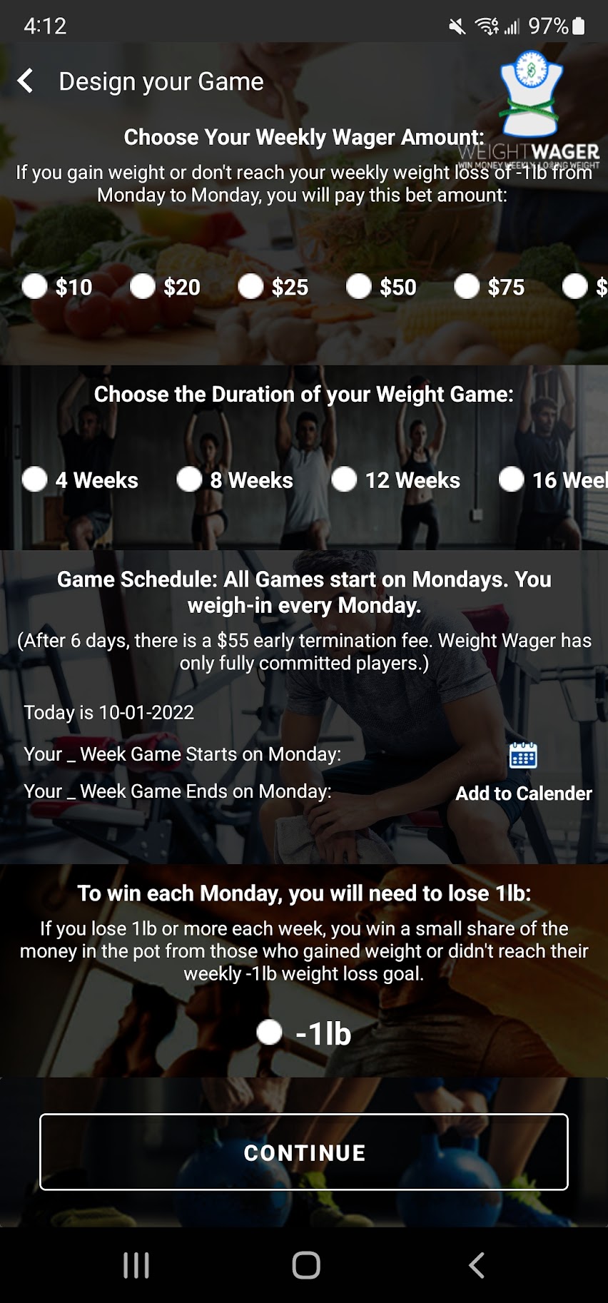
The users had an issue with being overwhelmed with too many different game options at one during onboarding. I call this the 'casino effect'. You get out on the game floor for the first time and where do you start? So many options. So based on this feedback I redesigned the onboarding game choice screen with 4 basic options based on the 4 main user personas that I found during the UX research stage.
Initial Wireframed Iteration to establish feature
Post Research UI Solution
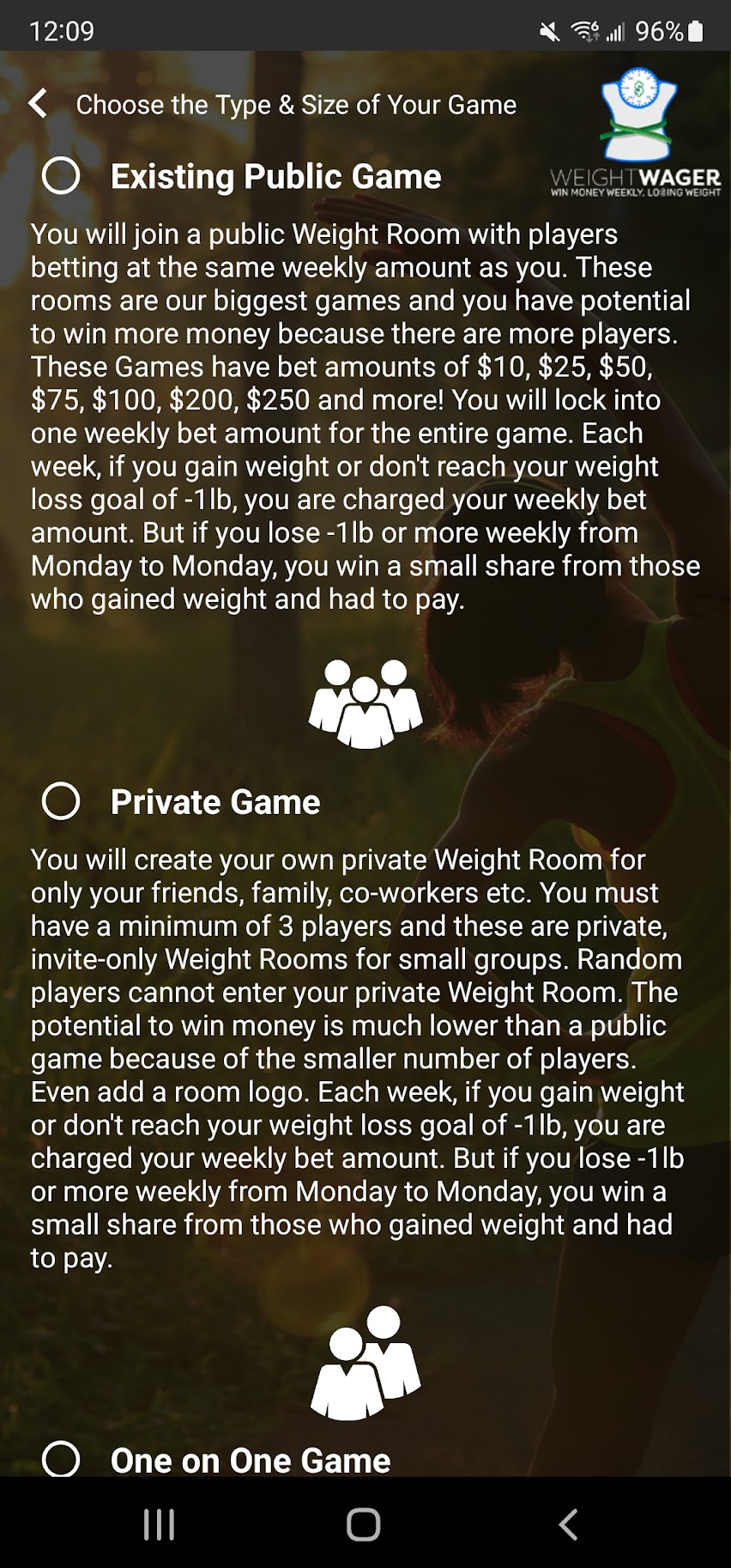
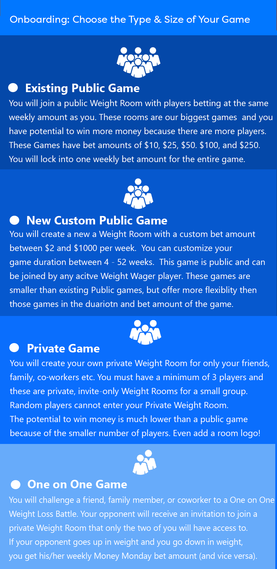
Solution: Simplified game options down to 3 game types
After this was changed in the app, I no longer had basic questions on which game to choose, because all of that was defined in the user text of the onboarding screen and served the 3 personas and user needs/types.
Solving for the user:
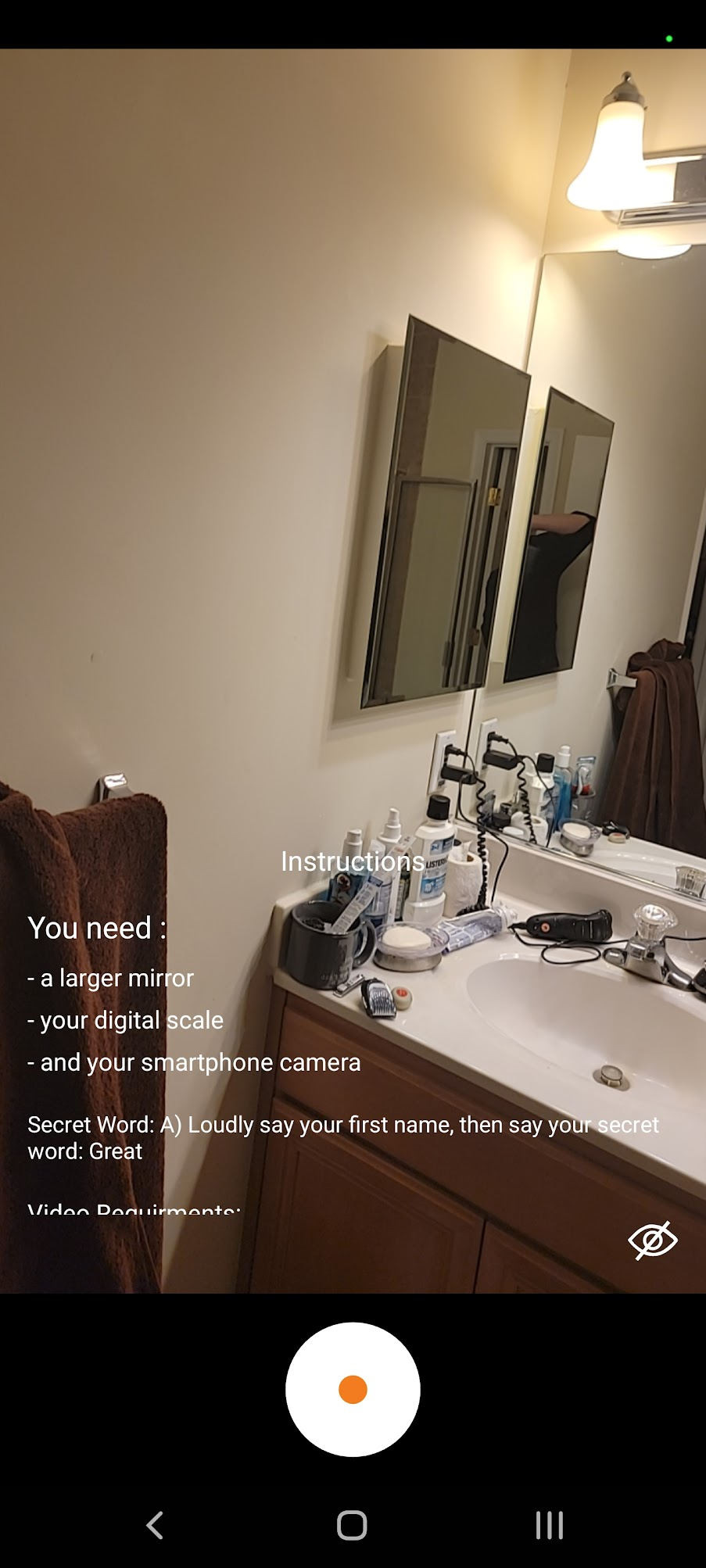
Problem/Pain Point #02 - Game Weigh-in Simplifications
User Research Insight:
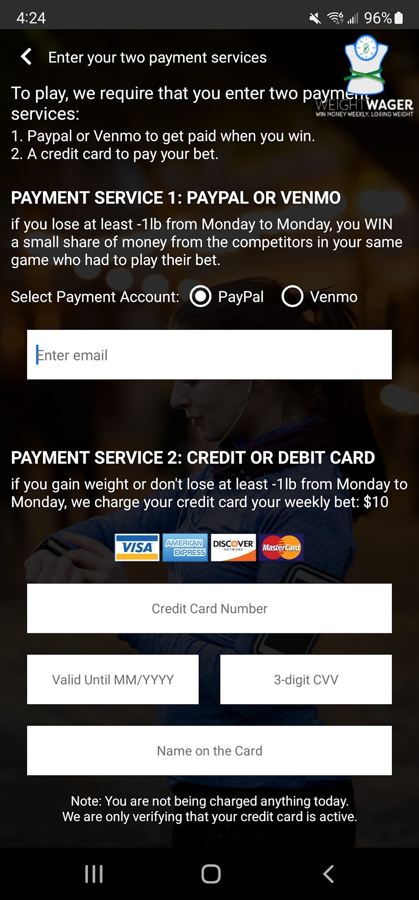
Users had questions when it came to their first video weigh-in, in the app onboarding process. The users have to do a practice video weigh-in before on-boarding into the actual game and being live where it can charge their payment method. Because this is a revenue opportunity we really had to ensure that the user's were onboarding properly and were properly informed. So as more and more users onboarded and we saw what their questions, confusions and pain points where, we simplified the weigh-in AND offered them example weigh-in videos because we know that you can text instruct all day but some users have to see it - the are visual learners. And this is a 30 second process with different steps.
Iteration 2: High Fidelity Wireframe with less text and Simpler, Shorter steps
Iteration 1: Initial Wireframe to establish feature
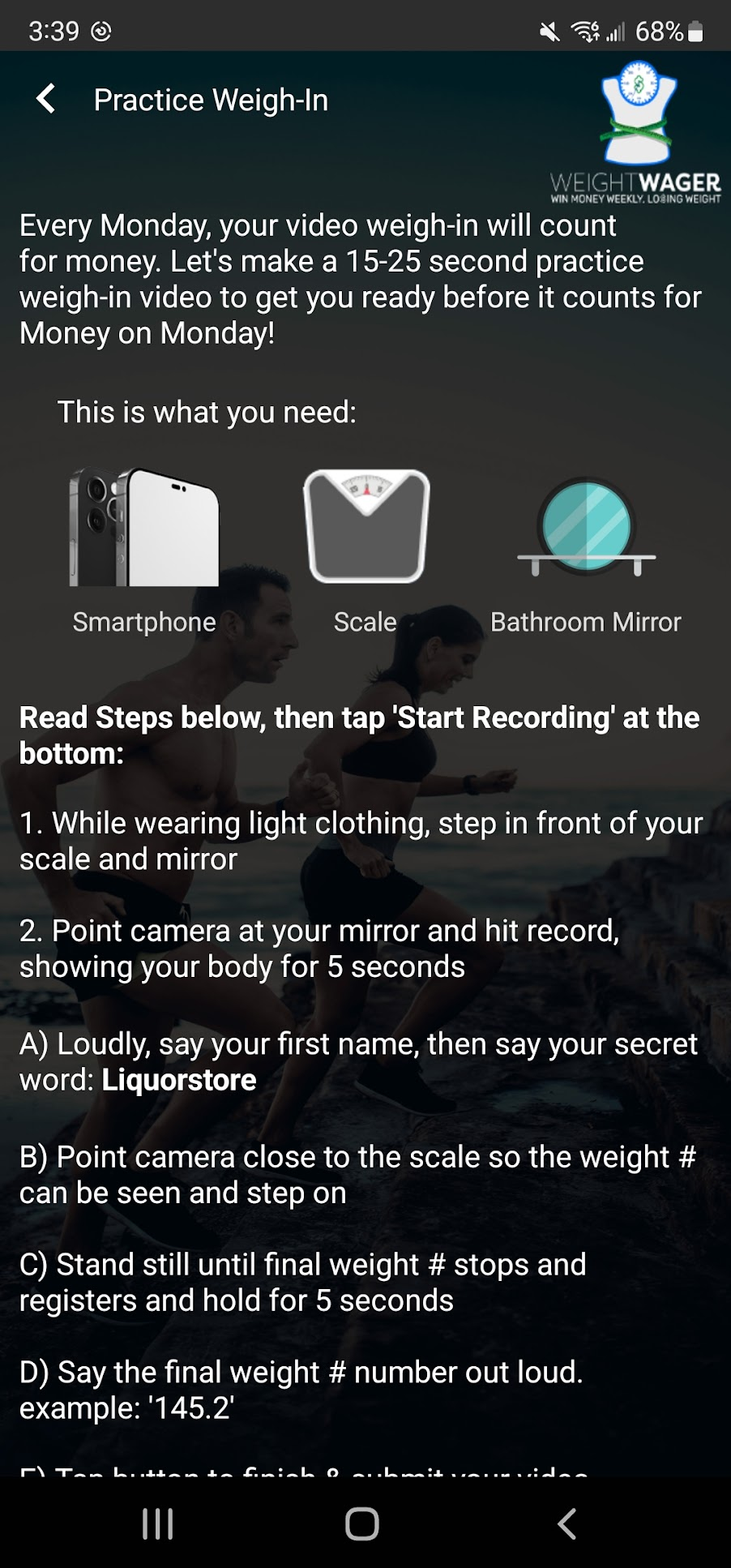
Iteration 3: Weigh-in instructions over the weigh-in video as they were doing the weigh-in.
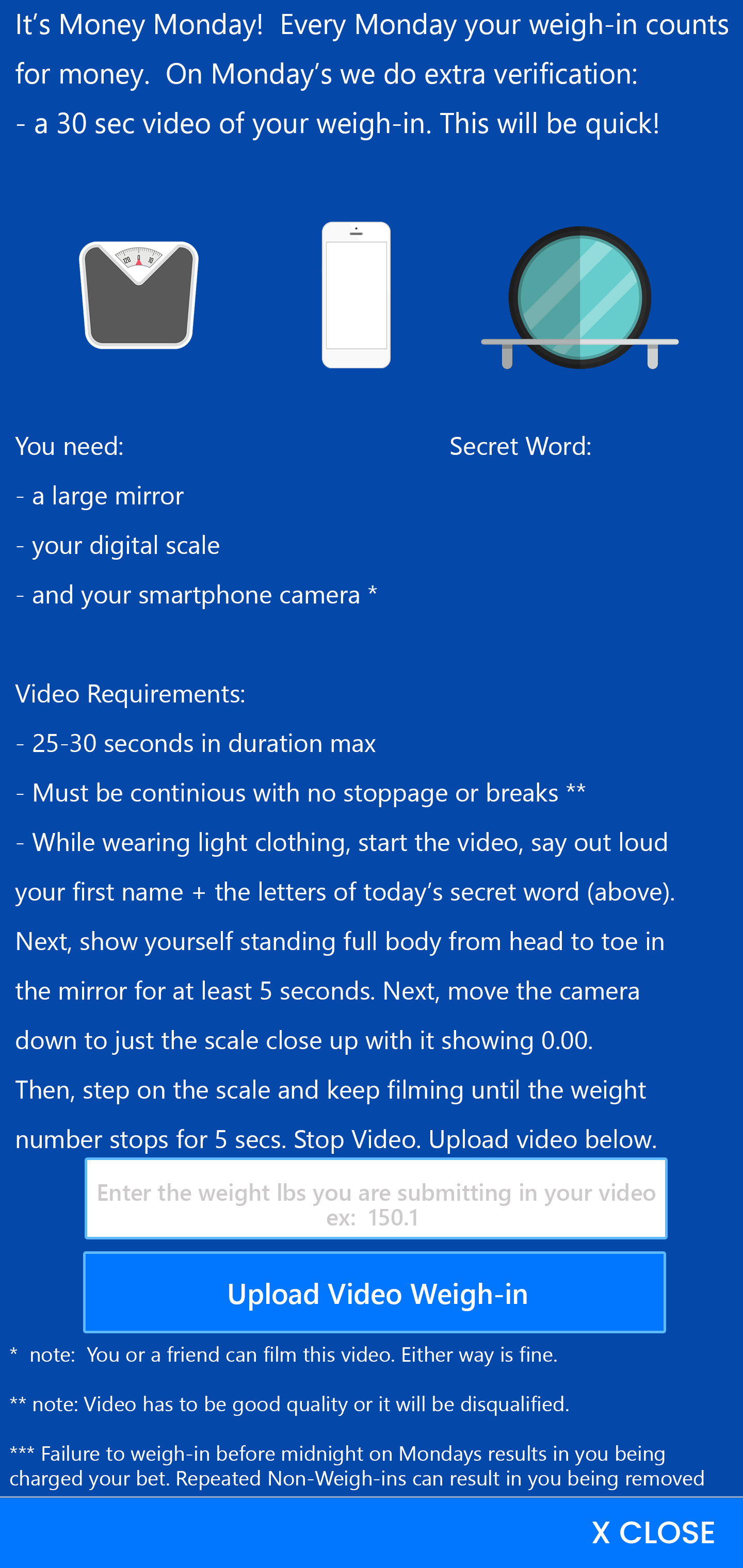
Solving for the user:
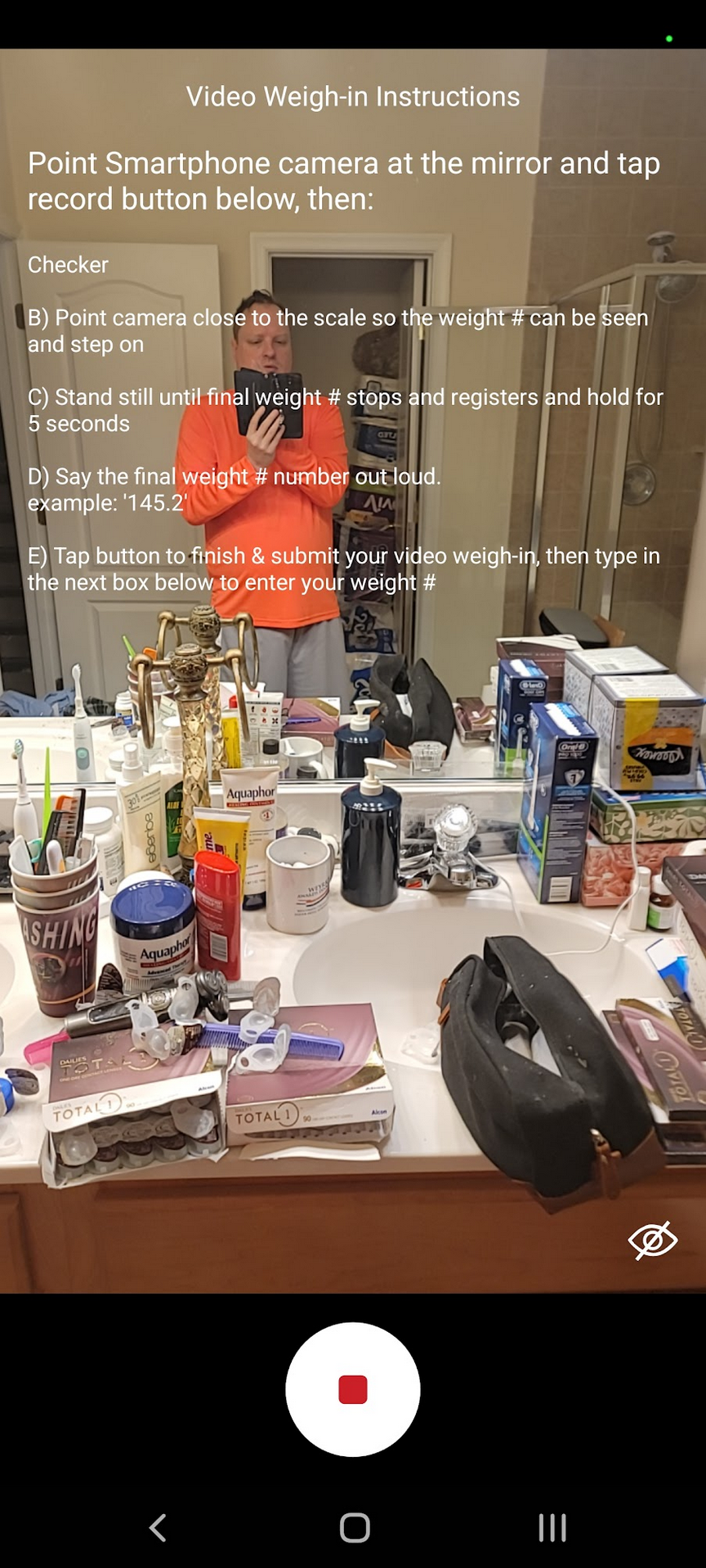
Problem/Pain Point #02:
Game Weigh-in Simplifications
User Research Insight:
Too must text and too many steps to remember for the user.
The solution was much shorter weigh-in instructions over the weigh-in video as they were doing the weigh-in. This stopped the user from having to refer to a previous screen and the shorter text led to correct weigh-ins and faster uploads.
Mid Fidelity Wireframes
Final UIs


 FULL UX PROCESS
ALL CASE STUDIES
Rosary Experience CASE STUDY
FULL UX PROCESS
ALL CASE STUDIES
Rosary Experience CASE STUDY
Call the number below for a pre-recorded
3 minute message that details rate, UI UX skills and more.